Are you a book lover who wants to delve into the intricacies of hardcover books? Do you often wonder what makes them so durable and appealing? Look no further! In this comprehensive guide, we’ll take apart the anatomy of a hardcover book, exploring each component that comes together to create an engaging reading experience. From endpapers to spines and everything in between, we’ll cover it all. So grab your favorite hardcover book and join us on this journey of discovery!
Introduction to Hardcover Book Anatomy
A hardcover book is made up of several different parts, all of which work together to create a finished product. In this guide, we’ll take a look at the different parts of a hardcover book and how they all come together.
The cover is the first and most visible part of a hardcover book. The cover can be made from a variety of materials, but most often it is made from paper or cloth. The cover also includes the book’s spine, which is where the pages are attached.
The pages of a hardcover book are usually made from paper that is slightly thicker than standard printer paper. The pages are glued to the spine of the book and then trimmed to create a smooth edge.
Hardcover books also have an endpapers, which are usually made from thin cardboard. Endpapers help to protect the pages of the book and provide a surface for attaching the cover to the rest of the book.
Finally, hardcover books have dust jackets. Dust jackets are made from thin paper and help to protect the cover and spine of the book from wear and tear.
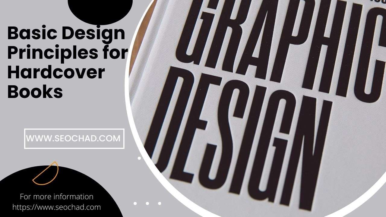
Cover Design Principles
There are a few key things to keep in mind when designing the cover of a hardcover book.
First, the cover should be eye-catching and attractive, as this is what will help to sell the book.
Secondly, the cover should be appropriate for the genre and audience of the book. For example, a children’s book will have a different cover design than an adult novel.
Thirdly, the cover should be durable, as it will need to withstand being handled multiple times.
Fourth, the cover should be easy to read, with clear and legible text.
Finally, the overall design of the cover should be cohesive and professional.
Spine Design Principles
The spine of a hardcover book is one of the most important design elements. It is the first thing that a reader will see when picking up a book, and it needs to be both functional and visually appealing. Here are some key principles to keep in mind when designing a book spine:
- The spine should be wide enough to accommodate the thickness of the book’s pages.
- The spine should be sturdy enough to support the weight of the book.
- The spine should be smooth, so that it can be easily turned by the reader.
- The spine should be free of any sharp edges or corners that could damage the pages or hurt the reader’s hands.
- The spine should be simple and uncluttered, so that the book’s title and author are clearly visible.
- The spine should be designed with an eye for balance, so that it looks pleasing when displayed on a shelf.
Endpaper Design Principles
When it comes to the endpapers of a hardcover book, there are three design principles that should be taken into account: functionality, durability, and aesthetics.
Functionality: The endpapers of a hardcover book need to be functional in order to properly protect the book’s spine and pages. They should be made of a material that is durable and will not tear easily.
Durability: The endpapers of a hardcover book need to be durable in order to withstand repeated use. They should be made of a material that is resistant to wear and tear.
Aesthetics: The endpapers of a hardcover book should be aesthetically pleasing in order to complement the book’s overall design. They should be made of a material that is attractive and will not discolor over time.
Interior Page Design Principles
When it comes to the interior pages of a hardcover book, there are a few key design principles to keep in mind. First and foremost, the text should be easy to read and the pages should be laid out in an aesthetically pleasing way. In terms of typography, using a serif font for body text is generally considered to be the most readable option. As for page layout, it’s important to create ample white space around the text so that readers don’t feel overwhelmed by dense blocks of text.
In addition to these general principles, there are also a few things to keep in mind when designing specific types of pages within a book. For instance, chapter openings often include an enlarged or decorative first letter, while drop caps can be used to add visual interest to body text paragraphs. And finally, don’t forget about those all-important back matter pages! The acknowledgments, author bio, and other such pages provide valuable information about the book and its creators, so they shouldn’t be neglected in the design process.
Binding and Finishing Techniques
Binding and finishing techniques play a critical role in the overall quality of a hardcover book. In this section, we’ll take a closer look at some of the most common binding and finishing techniques used in the book publishing industry.
One of the most popular binding methods is perfect binding. Perfect binding uses an adhesive to attach the cover to the spine of the book, which results in a clean, flat surface. This method is often used for mass-produced books such as paperbacks and hardcover books with dust jackets.
Another common binding method is saddle stitching. Saddle stitching is often used for smaller books or pamphlets because it’s a simple and cost-effective way to bind pages together. This method involves threading wire through pre-drilled holes in the spine of the book, which are then clinched on either side to secure the pages.
If you’re looking for a more durable binding option, case binding might be right for you. Case binding uses cloth or paper over boards to create a sturdy cover that will protect your pages from wear and tear. This method is often used for textbooks and other reference materials that need to withstand heavy use.
Finally, there’s perfect bound hardcover books without dust jackets. As the name suggests, this type of book is perfect bound with an adhesive, but it doesn’t have a dust jacket. Perfect bound hardcover books without dust jackets are typically used for nonfiction books, cookbooks.
Common Typefaces for Book Design
When it comes to book design, there are a few typefaces that are commonly used. Here is a look at some of the most popular typefaces for book design:
Bembo: Bembo is a serif typeface that was created by an Italian printer in the 15th century. It is widely used in book design, particularly for body text.
Garamond: Garamond is another popular serif typeface that has been used in printing since the 16th century. It is known for its readability and elegant appearance.
Helvetica: Helvetica is a sans-serif typeface that was created in the 1950s. It is widely used in both print and digital media.
Times New Roman: Times New Roman is a serif typeface that was created specifically for newspapers in the early 20th century. However, it has since become one of the most widely used typefaces for all kinds of printed materials, including books.
Conclusion
To conclude, the anatomy of a hardcover book is composed of several important components that all play an integral role in producing high-quality books. Knowing and understanding each component’s purpose can help you design beautiful and durable hardcover books. Whether you’re looking to create a one-of-a-kind coffee table book or just want to be aware of the different parts of your favorite novel, this guide should have provided you with some helpful knowledge on the anatomy of a hardcover book.